Sign in

| Created |  Urls Urls |
Favourites | Opened | Upvotes | Comments |
| 4. Oct 2019 | 2 | 0 | 283 | 0 | 0 |
CSS Grid is basically a web page layout tool that often significantly reduces complexity and increases control over page layout compared to deprecated layout tactics like tables, floating divs etc.
Index :
Appendixes :
 CSS Grid for standard layout
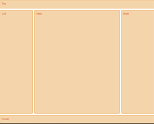
The standard layout have a :
However, often we want the header to be fixed, so here I will make an html that can switch between scroll header and fixed header (a single css property will switch between these 2 layouts).
 Scroll headerFixed header
The HTML code contains a separate div for the fixed top that can be activated in the CSS. In addition it is advantegous to separate grid item divs from content divs by adding child div in each grid item.
<div id="divFixedTop">Top</div>
<div id="divGridLayout">
<div id="divGridTop" class="grid-item">
<div id="divTop">Top</div>
</div>
<div id="divGridLeft" class="grid-item">
<div id="divLeft">Left</div>
</div>
<div id="divGridMain" class="grid-item">
<div id="divMain">Main</div>
</div>
<div id="divGridRight" class="grid-item">
<div id="divRight">Right</div>
</div>
<div id="divGridFooter" class="grid-item">
<div id="divFooter">Footer</div>
</div>
</div>
The CSS code (below) have 3 parts :
html {
height: 100%;
}
body {
height: 100%;
padding: 0;
margin: 0;
}
#divGridLayout {
max-width: 926px;
height: 100%;
margin: 0 auto; /* center the grid horizontally */
display: grid;
grid-gap: 10px;
grid-template-columns: 200px auto 200px;
grid-template-rows: 50px auto 50px;
}
#divGridLayout > div.grid-item {
border: 2px solid rgb(233,171,88);
border-radius: 5px;
background-color: rgba(233,171,88,.5);
padding: 10px;
color: #d9480f;
}
#divGridTop {
grid-column-start: 1;
grid-column-end: 4;
}
#divGridFooter {
grid-column-start: 1;
grid-column-end: 4;
}
#divFixedTop {
display: none; /* remove this to get fixed header */
position: fixed;
top: 0;
left: 0;
right: 0;
height: 50px; /* height equal to divGridTop */
z-index: 11;
background-color: #f7f7f7;
}
The above css grid layout is both remarkably simple and reliable compared to earlier layout tactics. In Sticky Menus I build upon this css grid layout to build sticky boxes and fixed sidebars.
CSS Grid stripingStriping helps the human eye to faster understand data organization, is widely used and was so easy with bootstrap tables. In css grid striping is more difficult to achieve, however it is potentially also more flexible.
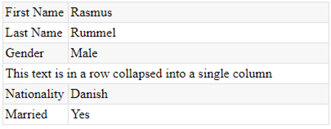
Typical and fairly simple striping example with alternate row colors and one row collapsed into a single cell.
The above striped grid is created from the following HTML:
<div id="divStripedGrid">
<div class="grid-item">First Name</div>
<div class="grid-item">Rasmus</div>
<div class="grid-item">Last Name</div>
<div class="grid-item">Rummel</div>
<div class="grid-item">Gender</div>
<div class="grid-item">Male</div>
<div id="divStripedGridCollepsedRowColumn1" class="grid-item" style="display:none;"></div>
<div id="divStripedGridCollepsedRowColumn2" class="grid-item">This text is in a row collapsed into a single column</div>
<div class="grid-item">Nationality</div>
<div class="grid-item">Danish</div>
<div class="grid-item">Married</div>
<div class="grid-item">Yes</div>
</div>
... and then CSS will be doing the rest.
Creating the alternate stripes and finalizing the borders relies on the nth-child css pseudo selector, there I use the an+b formula to select grid items :
We can define each row in terms of cell number - here for 2 columns :
Ok, so we use the nth-child(formula) to select these cells - we need 2 selectors :
<style>
#divStripedGrid {
display: grid;
grid-gap: 0;
grid-template-columns: 80px auto;
width: 400px;
}
.grid-item {
padding: 3px;
border-bottom: solid 1px #dfdfdf;
border-left: solid 1px #dfdfdf;
}
/* select row 1, 3, 5 etc */
.grid-item:nth-child(4n+1), .grid-item:nth-child(4n+2) {
background-color: #f7f7f7;
}
/* select top row */
.grid-item:nth-child(-n+2) {
border-top: solid 1px #dfdfdf;
}
/* select right column */
.grid-item:nth-child(2n) {
border-right: solid 1px #dfdfdf;
}
/* select first cell in each row */
.grid-item:nth-child(2n+1) {
display: flex;
align-items: center;
}
#divStripedGridCollepsedRowColumn2 {
grid-column: 1/3;
}
</style>
In order to finalize the borders, we need to select the top row and the last (second) column.
The top row consist of cell 1 & 2 and can be selected like this :
The second column can be selected like this :
Lastly, we collaps cell 7 & 8 into a single row by setting display="none" on one of the cells (here cell 7) and expand the other cell (here cell 8) to fill the full row :
That's all - css grid striping is not as easy as bootstrap tables, but also not too difficult then you first get the hanging of it.
CSS Grid Row MouseoverOn tabular structures like tables or grids it is often convenient to style a row then the mouse hovers that row to assist the user understanding what values belong together.
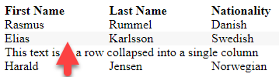
In this grid we have 3 columns with 1 row of column headers and 4 rows of data. Then the mouse hovers a data item, the whole of the row to which the item belongs will be styled with a different background color.
First the HTML that makes up the Grid :
<div id="divRowHover">
<div class="header">First Name</div>
<div class="header">Last Name</div>
<div class="header">Nationality</div>
<div rowId="1">Rasmus</div>
<div rowId="1">Rummel</div>
<div rowId="1">Danish</div>
<div rowId="2">Elias</div>
<div rowId="2">Karlsson</div>
<div rowId="2">Swedish</div>
<div rowId="3" style="grid-column:1/4;">This text is in a row collapsed into a single column</div>
<div rowId="4">Harald</div>
<div rowId="4">Jensen</div>
<div rowId="4">Norwegian</div>
</div>
Notice the rowId attribute : all cell items belonging to the same row will get the same rowId - this means that then hovering a cell item, we can use its rowId to find all other cell items in the same row and then change the background color on each of these cells.
Then the CSS that turns the above HTML into a Grid:
<style>
#divRowHover {
width: 400px;
display: grid;
grid-template-columns: auto auto auto;
}
#divRowHover .header {
font-weight:bold;
}
</style>
Third and lastly the Javascript that makes it happen:
<script>
document.addEventListener("DOMContentLoaded", function() {
let divRowHover = document.querySelector("#divRowHover");
let gridItems = divRowHover.querySelectorAll("div");
for (var gi = 0; gi < gridItems.length; gi++){
let gridItem = gridItems[gi];
gridItem.onmouseover = function() {
let rowId = this.getAttribute("rowId");
let siblingItems = divRowHover.querySelectorAll("div[rowId='" + rowId + "']");
for (var si = 0; si < siblingItems.length; si++) {
siblingItems[si].style.backgroundColor = "#f7f7f7";
}
}
gridItem.onmouseout = function() {
let rowId = this.getAttribute("rowId");
let siblingItems = divRowHover.querySelectorAll("div[rowId='" + rowId + "']");
for (var si = 0; si < siblingItems.length; si++) {
siblingItems[si].style.backgroundColor = "";
}
}
}
});
</script>
In the above Javascript we assign a mouseover and mouseout eventhandler to each and every data cell in the grid. In the eventhandler we will get the rowId and then find all cells with the same rowId (these cells we call siblingItems) and then change the background color on all sibling cells.
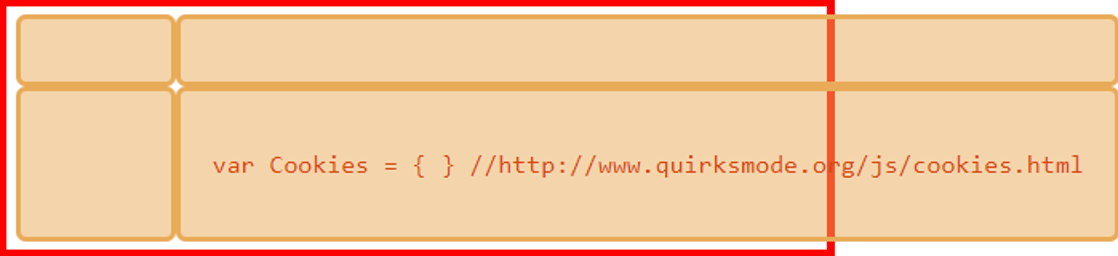
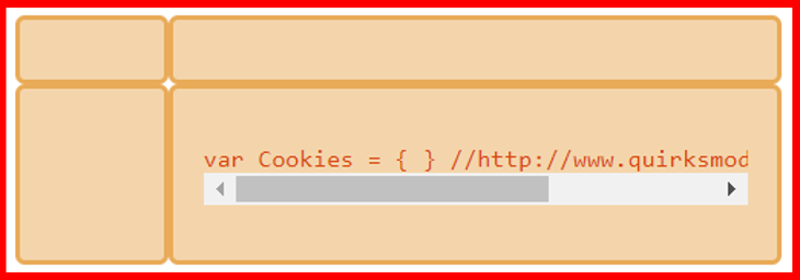
CSS Grid and the pre-tagThen placed inside a css grid item (or a flex item), the pre-tag does not respect the width property of that grid item - this can result in nasty overflows.
Let's say we have a 400px wide container and we have a grid inside, and we want the gid to fill the container. If we set explicit width on each column, we have no problems with the pre-tag, however often we don't know the parent container and have to use the auto value to fill available space - in this case the pre-tag will give us problems.
Our test grid look like this :
<div id="divGrid">
<div class="grid-item"></div>
<div class="grid-item"></div>
<div class="grid-item"></div>
<div class="grid-item">
<pre style="overflow:auto;">var Cookies = { } //http://www.quirksmode.org/js/cookies.html</pre>
</div>
</div>
And the css for grid :
#divGrid {
display: grid;
grid-template-column: 80px auto;
}
Unfortunately the pre width is NOT affected by the space available inside the grid item (the parent of the pre tag) and therefore the overflow property on the pre have no effect - here is the result - the grid will overflow it's parent :
The solution is to set the min-width property on the grid item to zero. I don't understand why, and I have not been able to find a satisfactory answer on the internet, however it does work.
Change the html to this : (setting min-width to zero on the grid item containing the pre tag)
<div id="divGrid">
<div class="grid-item"></div>
<div class="grid-item"></div>
<div class="grid-item"></div>
<div class="grid-item" style="min-width:0;"> <!-- min-width:0 -->
<pre style="overflow:auto;">var Cookies = { } //http://www.quirksmode.org/js/cookies.html</pre>
</div>
</div>
We now get the expected result :
Appendix : CSS Grid fast primer
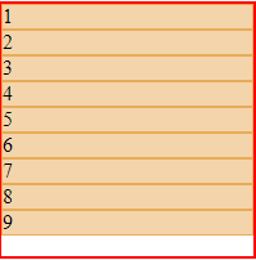
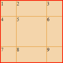
Say we have the following HTML :
<div id="divSomeContainer" style="width:200px;height:200px;border:solid 2px red;">
<div id="divGrid">
<div class="grid-item">1</div>
<div class="grid-item">2</div>
<div class="grid-item">3</div>
<div class="grid-item">4</div>
<div class="grid-item">5</div>
<div class="grid-item">6</div>
<div class="grid-item">7</div>
<div class="grid-item">8</div>
<div class="grid-item">9</div>
</div>
</div>
We can now make the #divGrid element a grid using this CSS:
#divGrid {
display:grid;
}
.grid-item { /* not necessary - only to easily visualize the grid items */
border: solid 1px rgb(233,171,88);
background-color: rgba(233,171,88,.5);
}
#divGrid is now a grid container and is created by setting the display:grid - in turn all the direct children of #divGrid will become grid items (the class="grid-item" is not what make the children grid items).
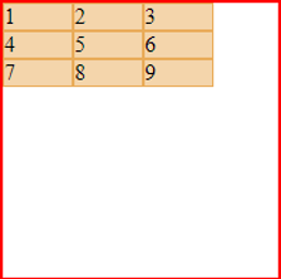
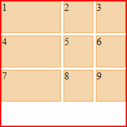
Default all grid items are organized in only 1 column, however by using the css property grid-template-columns, we can define how many columns we want and how width the columns are - here 3 columns each 50px wide.
#divGrid {
display:grid;
grid-template-columns: 50px 50px 50px;
}
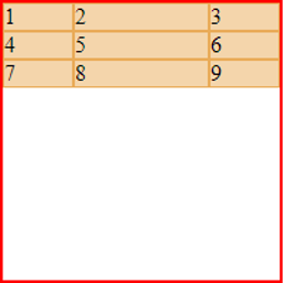
We can fill the available horizontal space using the auto value, here on the second column.
#divGrid {
display:grid;
grid-template-columns: 50px auto 50px;
}
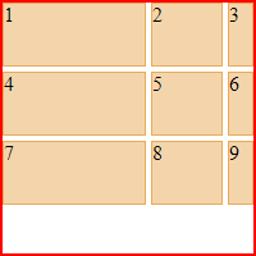
We use grid-template-rows to define the rows, here we set them 50px height except for the middle row that we want to fill out the available vertical space (we also need to specify that the grid container itself should fill the vertical space)
#divGrid {
display:grid;
height: 100%;
grid-template-columns: 50px auto 50px;
grid-template-rows: 50px auto 50px;
}
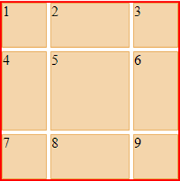
We use grid-gap to specify space between the grid items.
#divGrid {
display:grid;
height: 100%;
grid-template-columns: 50px auto 50px;
grid-template-rows: 50px auto 50px;
grid-gap: 4px;
}
Note that we can also use grid-column-gap & grid-row-gap for more control.
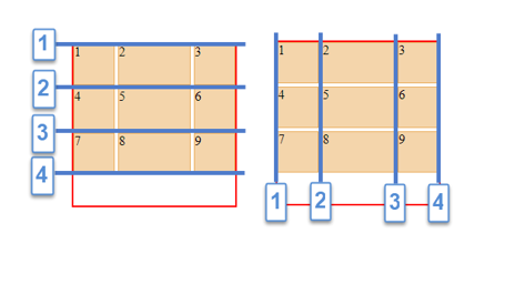
Grid lines are used to mark positions within a css grid. There are horizontal grid lines specifying vertical position and vertical grid lines specifying horizontal positions. In our 3x3 grid, there are 4 horizontal and 4 vertical grid lines.
To make a grid item span multiple columns and/or rows, we use the following css properties :
It is often convenient to use shortcuts like this :
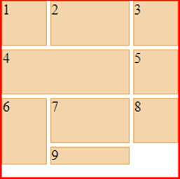
Let grid item 4 span from vertical grid line 1 to 3
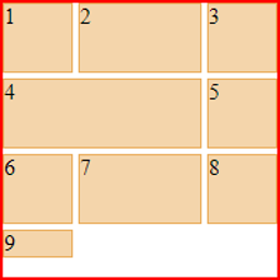
#divGrid {
display:grid;
grid-template-columns: 50px auto 50px;
grid-template-rows: 50px 50px 50px;
grid-gap: 4px;
}
.grid-item:nth-child(4) {
grid-column: 1/3;
}
Note grid item 9 have been moved to row 4 and there is no definition of row hight for row 4, so the row hight will default to content.
Let grid item 6 span from horizontal grid line 3 to 5
#divGrid {
display:grid;
grid-template-columns: 50px auto 50px;
grid-template-rows: 50px 50px 50px;
grid-gap: 4px;
}
.grid-item:nth-child(4) {
grid-column: 1/3;
}
.grid-item:nth-child(6) {
grid-row: 3/5;
}
A grid track is partly defined as the space between 2 grid lines - that is: a column or a row. So far we have defined track sizes in terms of pixels and auto to mix absolute sizing and filling, however we can also define grid tracks relative to each other using the fraction, fr, unit.
Here is our standard grid with vertical track sizes defined using the fraction unit.
#divGrid {
display:grid;
grid-template-columns: 1fr 1fr 1fr;
grid-template-rows: 50px 50px 50px;
grid-gap: 4px;
}
The fraction, fr, unit splits the available space up in the number of fractions specified in the css property (above the grid-template-columns specifies 3 fractions) and define track sizes according to how many of these fractions are assigned to each track.
Here the same grid is splitting the horizontal space up in 4 fractions assigning the first 2 fractions to the first first vertical track (first column).
#divGrid {
display:grid;
grid-template-columns: 2fr 1fr 1fr;
grid-template-rows: 50px 50px 50px;
grid-gap: 4px;
}
Fractions and pixels can be used together - first the absolute space is calculated and the rest is then available for fractioning, eg. if the width of the grid is 200px and 2 vertical tracks are sized absolute say 20px 30px, there are then 200-20-30 pixels left for fractioning.
#divGrid {
display:grid;
grid-template-columns: 2fr 1fr 20px; /* 180px are split into 3 fractions */
grid-template-rows: 50px 50px 50px;
grid-gap: 4px;
}
There are more to css grids than this, however the above covers the basics and allows for simple & reliable layouts. For more follows the links below.
Good luck.